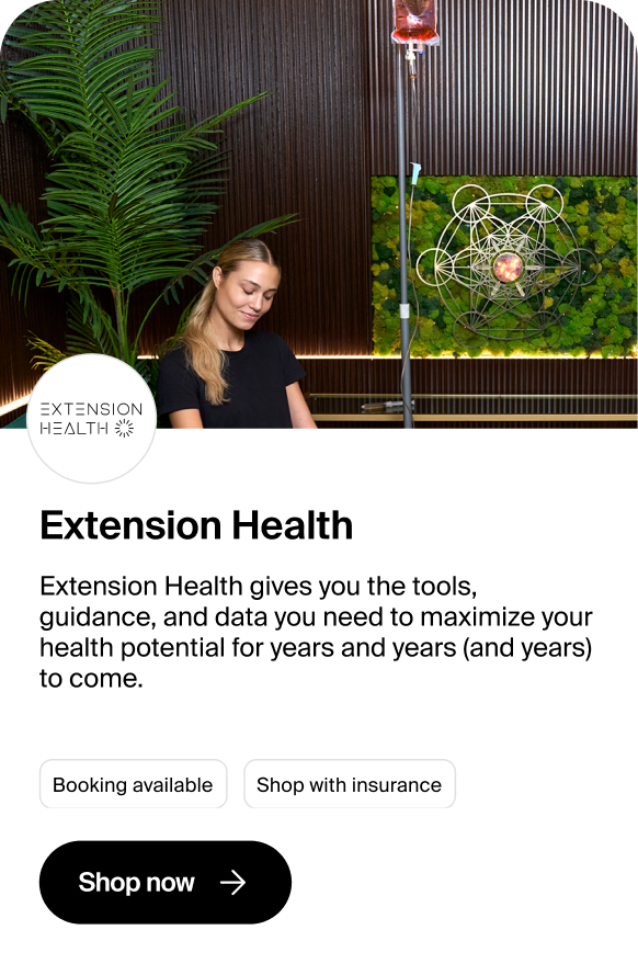


Superscript helps healthcare practices sell treatments online with upfront pricing. The Insurance Connector lets patients securely connect their insurance information so Storefront can show personalized pricing based on their coverage. But only around 20% of patients were engaging with it. I redesigned the experience to clarify the value of connecting, simplify the flow, and make insurance part of the core shopping experience.
Superscript partners with medical practices to create online storefronts where patients can see upfront prices and purchase treatments directly. For insured patients, connecting insurance enables personalized pricing based on their coverage and benefits.Across Storefront organizations, only ~40% of patients engaged with the existing Insurance Connector. We identified two potential barriers: unclear value and more effort than patients expected upfront.
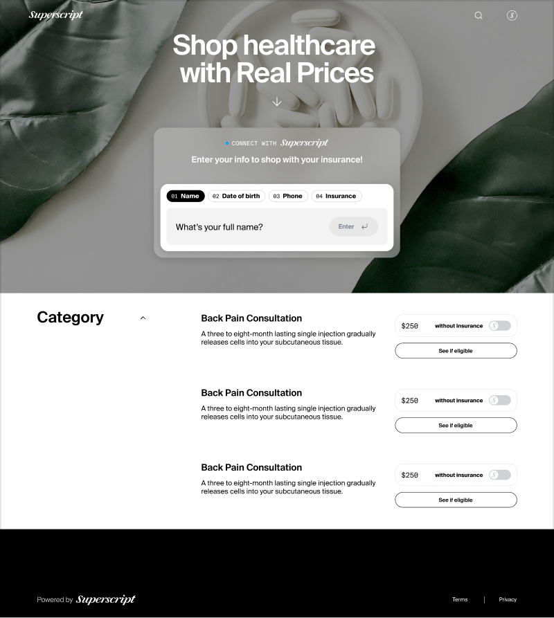
he existing experience asked patients to connect their insurance with little explanation of why it mattered or how it would affect the prices they saw. The connector also lived primarily in the Storefront hero, making it easy to lose once patients moved deeper into the shopping experience.Because connecting insurance while shopping for healthcare was still unfamiliar, we hypothesized that patients needed a clearer reason—and a more persistent way—to access it.
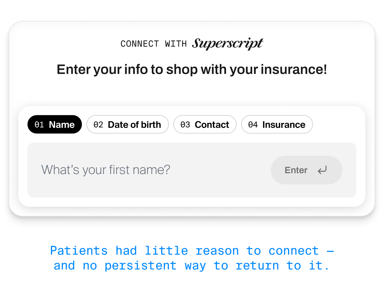
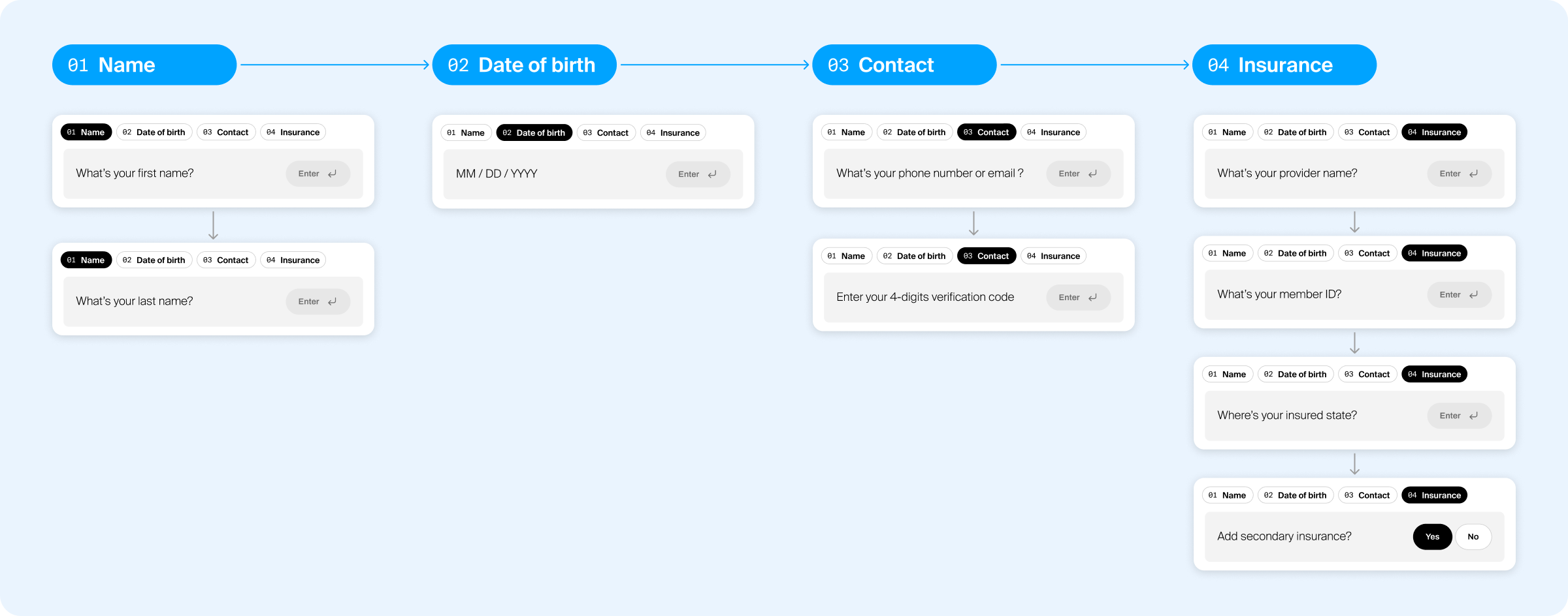
Nearly 30% of patients who started the flow abandoned it before completion. While the experience appeared to have four stages — name, date of birth, contact, and insurance — each stage unfolded into additional questions, making it difficult for patients to understand their progress or how much effort was still ahead.
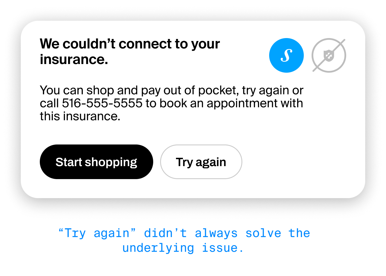
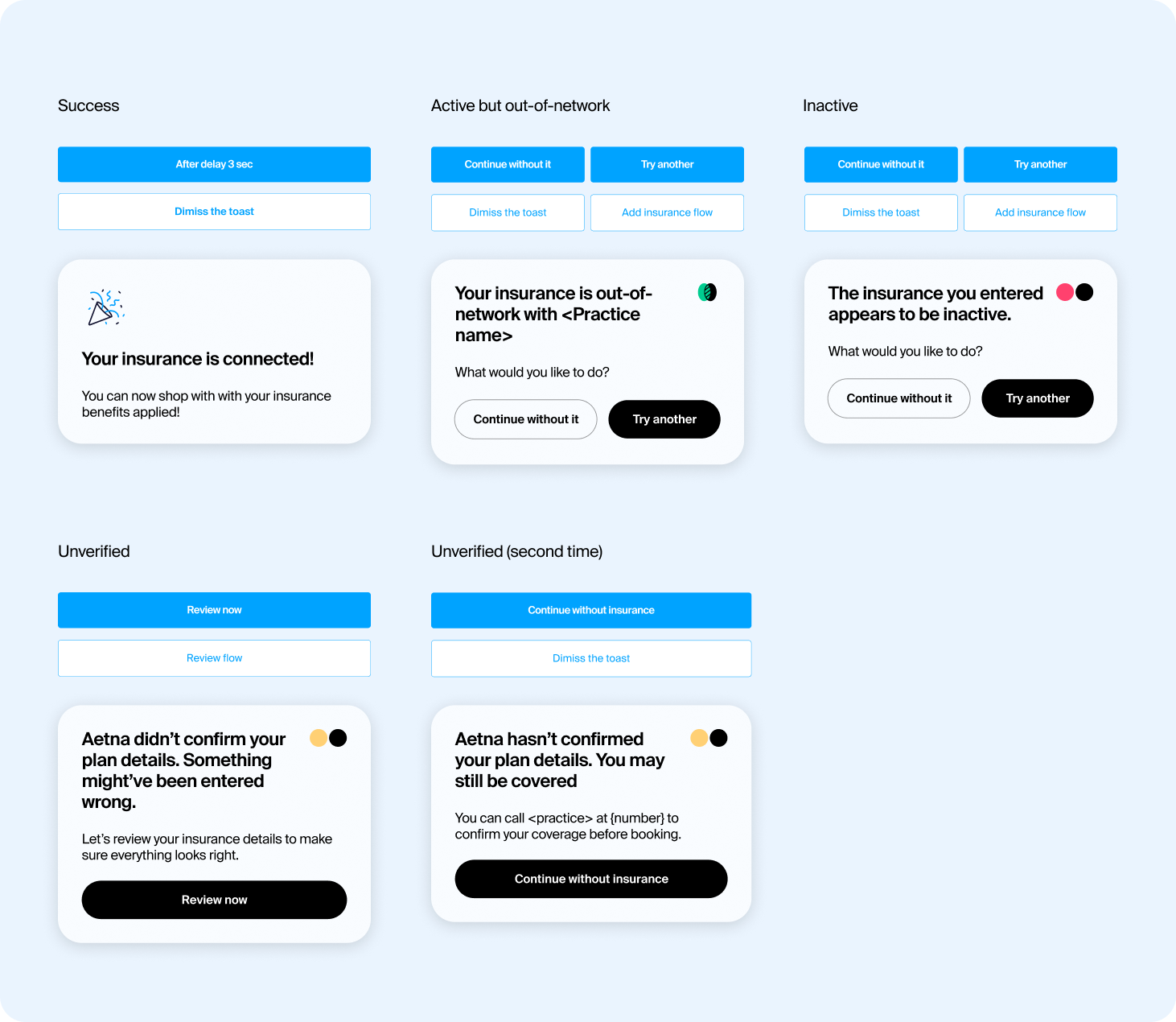
Support conversations revealed another gap: when insurance was unverified or inactive, patients could see their status but weren’t given a clear next step—often leaving them unsure how to proceed.
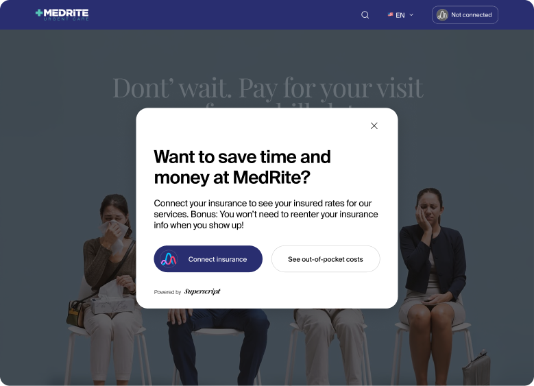
Rather than treating insurance as a form patients had to discover and complete, we reframed it as a guided decision: first explain why connecting matters, let patients choose whether to proceed, then guide them through the process with clear expectations and progress.
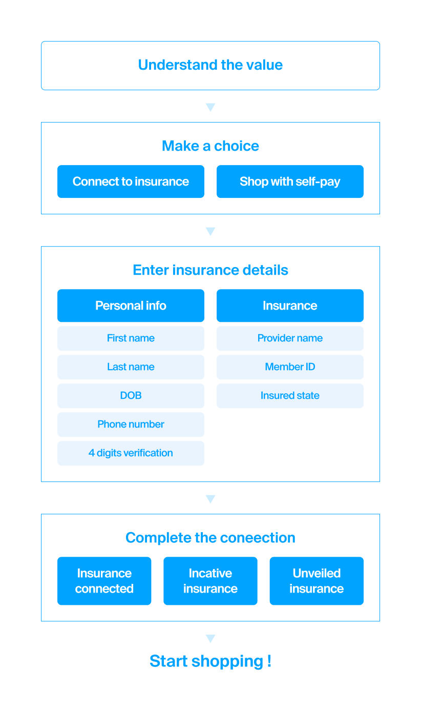
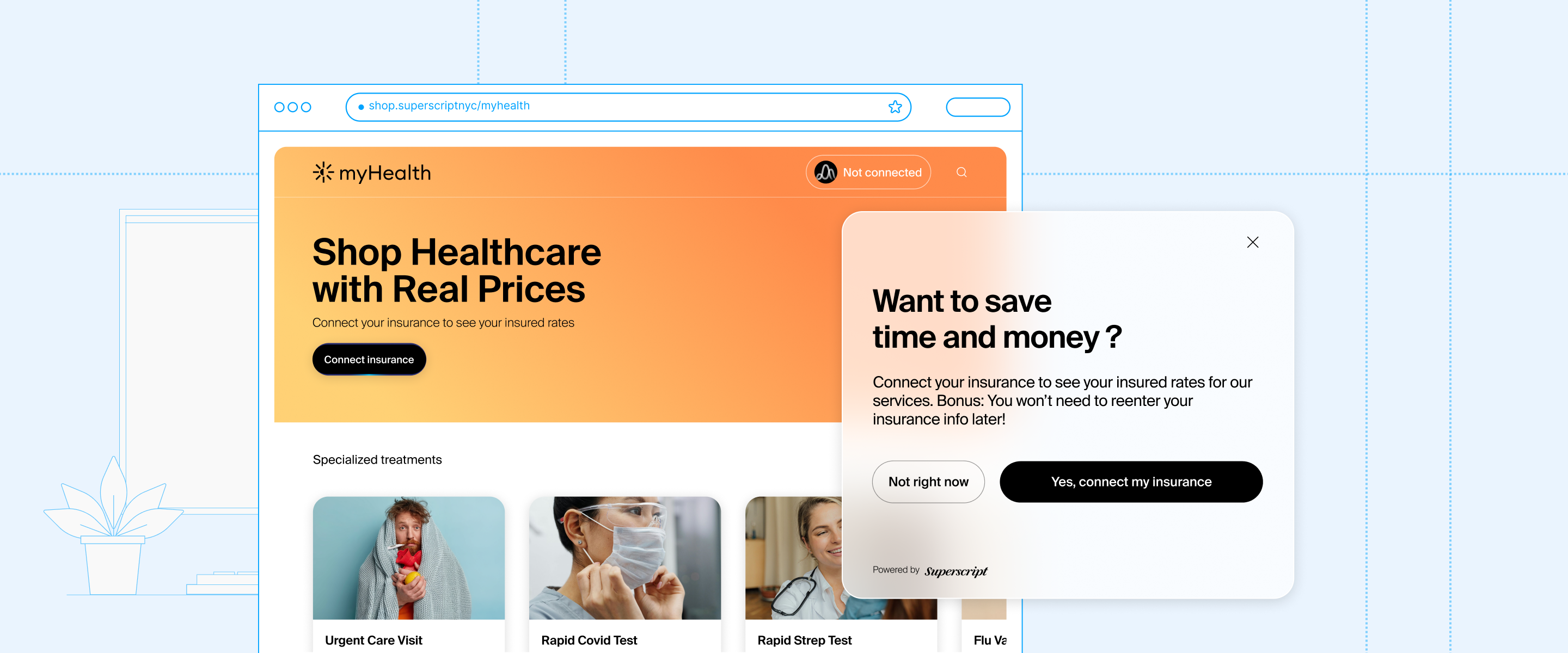
I explored three ways to bring insurance into the shopping journey, from making the existing connector more visible to proactively introducing it before patients began shopping. The team aligned on the interstitial as the most direct way to address visibility. It gives every patient a clear opportunity to understand the value of connecting insurance before shopping, while still allowing them to continue without it.
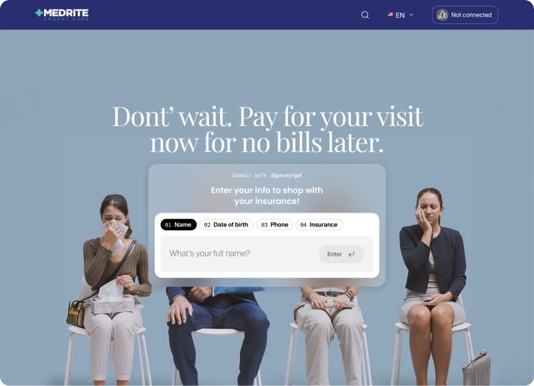
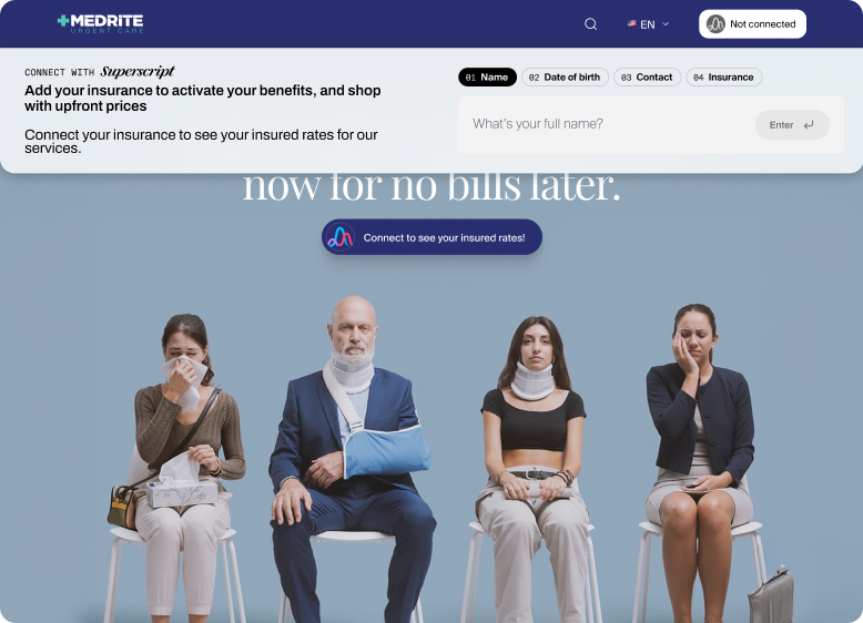
Rather than reducing the required information, we reorganized the flow into two clear stages — Personal Info and Insurance Info — to make the process easier to understand. A persistent progress bar shows patients where they are and what’s left, making the remaining effort more predictable.
Insurance verification isn’t always successful. I worked closely with product and engineering to map states such as connecting, verified, unverified, and inactive into clear patient-facing experiences. Each state communicates what happened and what the patient can do next.
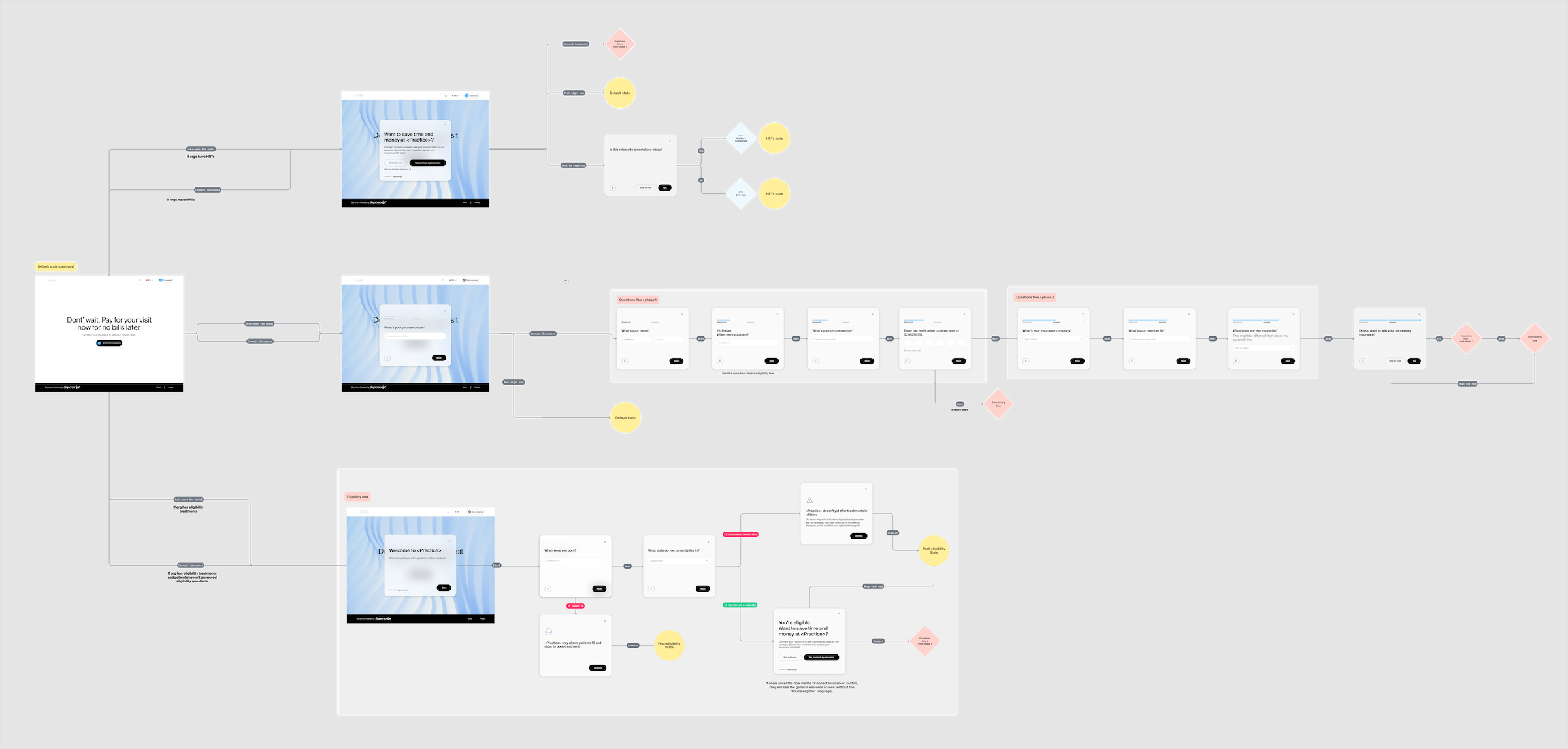
Insurance verification can take time. Instead of blocking patients behind a loading state, the connector minimizes into a persistent status indicator after submission.This allows patients to continue exploring treatments while verification happens in the background.
Each Storefront carries the practice’s own brand, so the insurance layer needed to feel recognizable without taking over. I explored the pricing toggle as a consistent Superscript touchpoint—using our color, icon, and motion language to distinguish insured pricing while keeping the practice brand primary.
Testing showed that generating insured prices could take longer than we expected. Rather than relying on a generic loading state, I explored a more expressive “Calculating price” animation using Superscript’s visual language—giving patients clear feedback while turning the wait into a more intentional part of the experience.
After launch, we saw a substantial increase in patients starting the insurance connection flow compared with the previous experience. The improvement remained consistent throughout the first month, giving us an early signal that making insurance more visible and contextual helped more patients engage with it.

20% previosuly
Started the insurance flow
70% previosuly
Reached a connection outcome

7 min previosuly
Average completion time
Figures shown are approximate and have been adjusted to protect confidential business data.
In a lightweight usability check with 8 participants, I noticed that most patients typed their answer, then moved back to the mouse to click Next after every question. Although pressing Enter could advance the flow, the interface gave no indication that this option was available.
I explored bringing the Enter action directly into the input field, making keyboard navigation visible at the moment of typing and reducing the need to repeatedly switch between keyboard and mouse.
This project started as an engagement problem, but evolved into a broader redesign of how insurance fits into the shopping experience—from when patients encounter it, to how they move through it, to what happens when verification doesn’t go as expected.